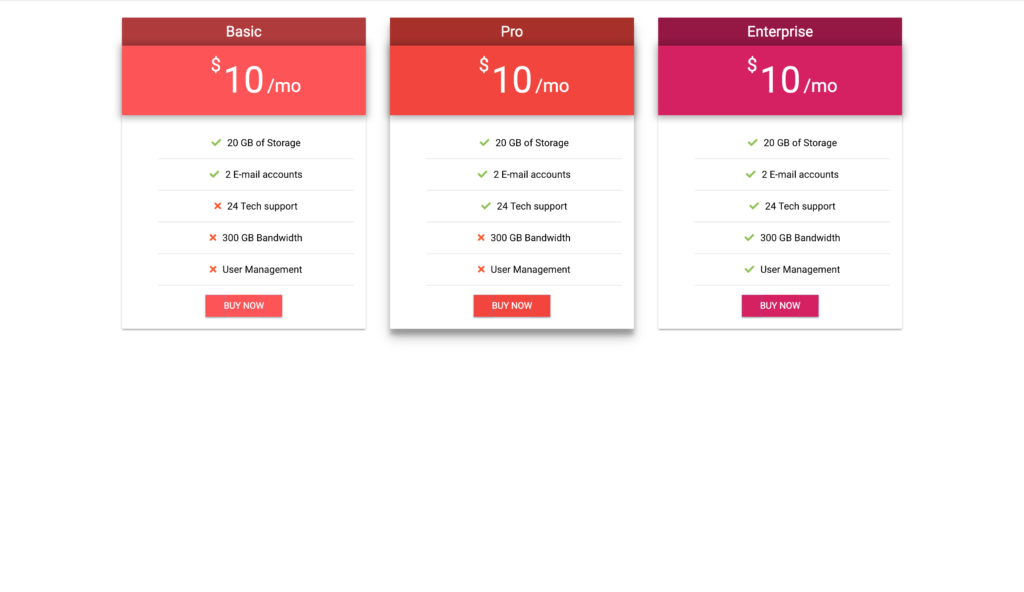
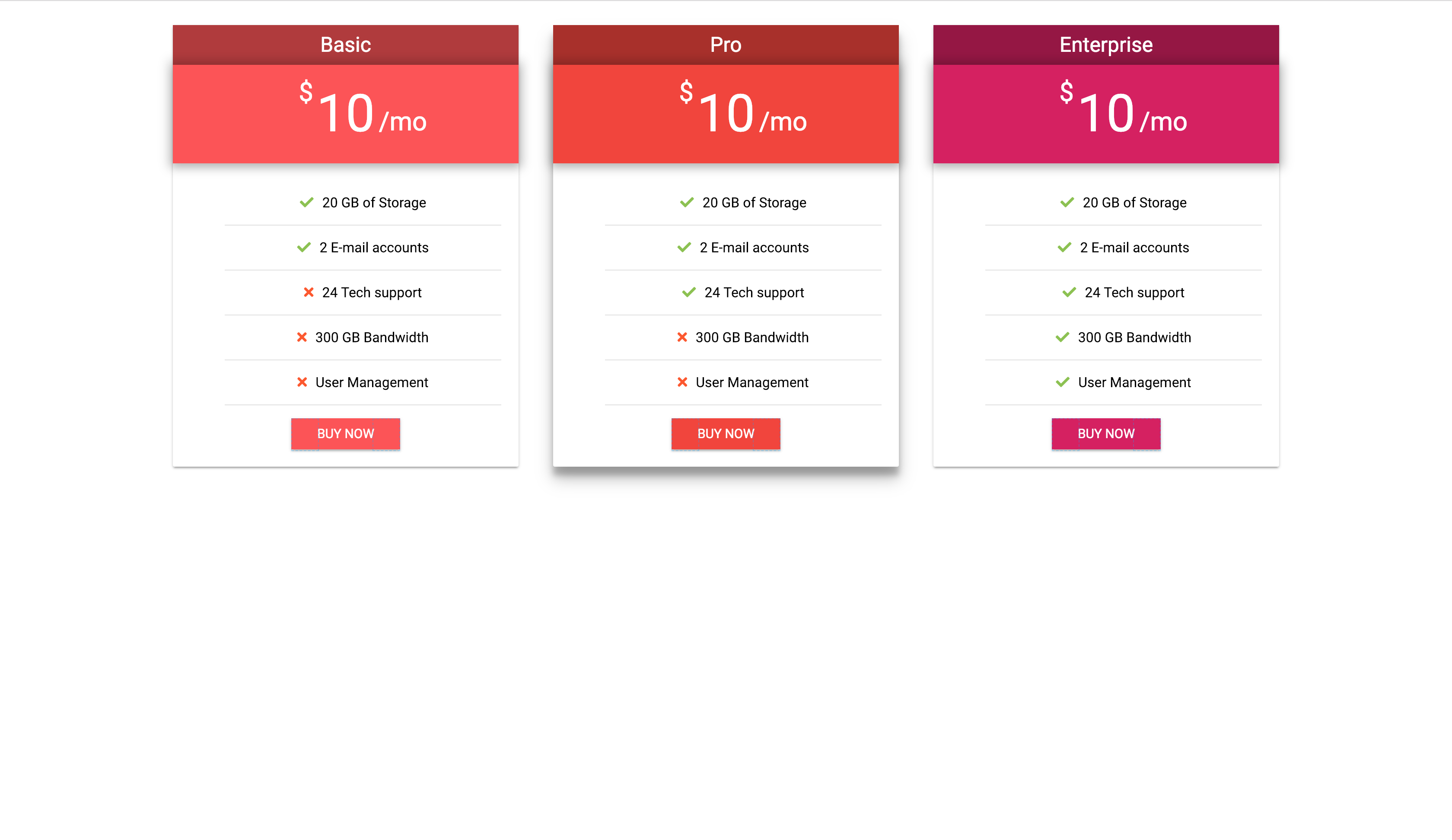
Material Design is big topic in all web design industry. It’s main google design language and it is clearly one of the best design approaches. That’s why my next how-to again is about material cards, but this time we will build simple and beautiful pricing table. We can use it for different type of services – from basic pricing plans to advanced tier pricing.
So let’s start!
HTML Section
We will use FontAwesome and primary font of the Material design- Roboto. After we loaded in our head tag we can start with our markup.
Because this card is little bit more complicated i will divide markup in two sections – card header and card content.
Lets start with card header.
Card Header
We have div class="card" with id="first", after that we have div class="card-header" where will be our code for our header of the card. In this div we have two divs – div class="package-name" and div class="price". First div is for title of the pricing plan. Second div is for our price. Title of the plan will be in span class="card-title", price will be in h2 tag.
Example:
[code language="html"]
<head>
<link href="https://fonts.googleapis.com/css?family=Roboto" rel="stylesheet">

<link src="https://use.fontawesome.com/releases/v5.3.1/css/all.css"></script>

</head>

<div class="card" id="1">
    <div class="card-header">
       <div class="package-name">
           <span class="card-title">Basic</div>
       </div>
       <div class="price">
           <h2>10</h2>
       </div>
    </div>
</div>
[/code]
Card Content
Our card content is build from one div withclass="card-content" and one unordered list with class="features". Also in every list we have paragraph with icon for our let’s say “have or don’t have” features in our plans. To make button at the bottom of our card we use anchor tag with class="btn".
Example for whole card:
[code language="html"]
<head>
<link href="https://fonts.googleapis.com/css?family=Roboto" rel="stylesheet">

<link src="https://use.fontawesome.com/releases/v5.3.1/css/all.css"></script>

</head>

<div class="card" id="first">
    <div class="card-header">
       <div class="package-name">
           <span class="card-title">Basic</div>
       </div>
       <div class="price">
           <h2>10</h2>
       </div>
    </div>
<div class="card-content">
    <ul class="features">
      <li>
        <p>
          <i class="fa fa-check"></i>20 Gb of Storage
        </p>
      </li>
      <li>
        <p>
          <i class="fa fa-check"></i>2 E-mail accounts
        </p>
      </li>
      <li>
       <p>
          <i class="fa fa-times"></i>24 Tech support
        </p>
      </li>
      <li>
        <p>
          <i class="fa fa-times"></i>300 GB Bandwidth
        </p>
      </li>
      <li>
        <p>
          <i class="fa fa-times"></i>User Management
        </p>
      </li>
    </ul>
    <a class="btn" href="#">buy now</a>
  </div>
</div>
[/code]
To make more two cards we only copy and paste the code two times.
NB! We also change id of the cards.
CSS Section
To style our main div of the card we use same properties from our previous tutorial Material Design Card – UI Design | Pure CSS. You can read it first to make idea what is the process of creating basic material cards. Also we use flexbox layout, if don’t know what it is you can read about it here.
So after that, we need to style our card header and place different colors on every card. To do this we first add to .card-header 100% of width and some background color. To change colors of other two cards and their buttons we use id’s of the cards. Also I choose to add some more shadow of the second card, this way card will stand out. This is good UX method to make visually more attractive choice for the user.
Example:
.card-header{
  width: 100%;
  background-color: #ff5252;
  color: #fff;
}

#second .card-header,#second .btn{
  background-color: #F44336;
}

#second{
  box-shadow: 0 14px 28px rgba(0,0,0,0.25), 0 10px 10px rgba(0,0,0,0.22);
}

#third .card-header, #third .btn{
  background-color: #d81b60;
}
After that we add some simple styling rules for inner content.
.package-name{
  padding: 5px;
  background-color: rgba(0,0,0,.3);
}

.card-title{
  font-size: 24px;
  font-weight: 300;
  line-height: 36px;
}

h2{
  font-size: 60px;
  line-height: 66px;
  font-weight: 300;
  margin: 0;
}
Now we need to style our price content. To make cool pop out effect we need to add some shadow to .price. To add dollar sign and per month sign we use pseudo elemnts :before and :after with respective margin rules.
.price{
  padding: 24px;
  box-shadow: 0 0px 18px 5px rgba(0,0,0,.18), 0 4px 15px 0 rgba(0,0,0,.15)
}

.price:before{
  content:'
Some simple styles for unorderd list to make them center and with proper proportions. Also adding color to our check and times icons.
.card-content{
  width: 90%;
  padding: 20px;
}

.features{
  list-style-type: none;
  margin: 15px 0 15px 0;
}

.features li{
  margin-bottom: 15px;
  border-bottom: 1px solid rgba(153,153,153,.298039);
}

.features li p{
  font-size: 16px;
}

.fa-check, .fa-times{
  margin-right: 10px;
}

.fa-check{
  color: #8bc34a
}

.fa-times{
  color: #ff5722
}
In the end we only need to style our button.
a{
  display: inline-block;
  background-color: #ff5252;
  color: #fff;
  height: 36px;
  padding: 0 30px 0 30px;
  font-size: 15px;
  line-height: 36px;
  text-decoration: none;
  text-transform: uppercase;
  box-shadow: 0 2px 2px 0 rgba(0, 0, 0, 0.14), 0 1px 5px 0 rgba(0, 0, 0, 0.12), 0 3px 1px -2px rgba(0, 0, 0, 0.2)
}
And our price table is done.

To view code on codepen click here.
Please subscribe to our youtube channel.


Comments are closed.