

In this post i’ll show you how to create product card with sleek animation and we will use only html and css. You can use product cards for any online shop to show your products or categories.
Now let me tell you what we are going to build.
We will make three cards and put images in it, after that we will create our text for every category. To make our cards more stylish and user experienced we will add some animation only with css. We will make our images to zoom in when we hover over our cards, also our text will slide in at the same time. Our animation will be simple and sleek but very effective and beautiful.
You can see the project in my codepen. Link in bottom of the post or watch my video in my youtube channel.
And before we started, subscribe for my youtube channel here
So enough speaking, lets get started.
HTML Section
First we need to make our layout via html, but before that let add our custom font and icon set in our head tag.
[code language="html"]
<head>
<link href="https://fonts.googleapis.com/css?family=Montserrat:400" rel="stylesheet">

<link src="https://use.fontawesome.com/releases/v5.3.1/css/all.css"></script>

</head>
[/code]
And now lets code our html for our card. First we make div with class=”card”, after that we load our category image. For our content we make div with class=”card-content”> and put our paragraph with class=”card-category” into anchor tag. So our code is loоking like that:
[code language="html"]
<div class="card">
  <img src="https://images.unsplash.com/photo-1540240878317-09ccd319e97c?ixlib=rb-0.3.5&ixid=eyJhcHBfaWQiOjEyMDd9&s=2d69099f7142a447593ec6f7c90f7ece&auto=format&fit=crop&w=668&q=80">
  <div class="card-content">
    <a href="#">
      <p class="card-category">Sportswear<i class="fas fa-chevron-right fa-sm"></i></p>
    </a>
  </div>
</div>
[/code]
Now we need to copy this code two times so we make three cards but we will change only the image and category text. After we did that we can start style our product cards and make them blink. 🙂
CSS Section
First we make our body to be responsive via flexbox grid. If you don’t know what is flexbox grid layout you can read in my other post about it here.
Our code for the body tag is:
[code language="css"]
body{
  display: flex;
  justify-content: center;
  align-items: center;
  flex-wrap: wrap;
  font-family: 'Montserrat', sans-serif;
}
[/code]
To style our card div we need to make it position:relative; and give it width: 250px and height: 350px;. Also we need to add margin:10px, overflow: hidden and some shadow. So our code looks like this:
[code language="css"]
.card{
  position: relative;
  width: 250px;
  height: 350px;
  margin: 10px;
  overflow: hidden;
  box-shadow: 0 2px 2px 0 rgba(0, 0, 0, 0.14), 0 1px 5px 0 rgba(0, 0, 0, 0.12), 0 3px 1px -2px rgba(0, 0, 0, 0.2);
}
[/code]
To view our image properly we need to make it 100% width.After our card is ok we need to style our .card-content and .card-category so our category label look good.
[code language="css"]
 img{
  width: 100%;
}

.card-content{
  position: absolute;
  bottom: 3rem;
  width: 100%;
  text-align: center;
  background-color: rgba(255,255,255,.7);
}

a{
  text-decoration: none;

}

.card-category{
  font-size: 22px;
  line-height: 20px;
  letter-spacing: 2px;
  margin: 15px;
  color: #000;
}

i{
  margin-left: 5px;
}
[/code]
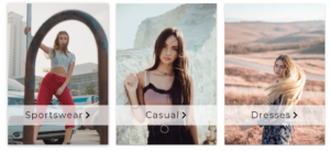
Our cards are ready and they look like this.
Building animation
But in the start of this post i told you that our card will have super duper simple and sleek animation only with pure css, so now let’s make it.
To make our animation we need only add some simple css rules.
1. Shadow effect
To make our shadow to change on hover we need to add two simple rules. First we need to add transition: all .2s linear to our .card, after that we need to set different box-shadow properties using :hover pseudo element.
[code language="css"]
.card:hover{
    box-shadow: 0 0px 28px rgba(0,0,0,0.25), 0 4px 10px rgba(0,0,0,0.22)
}
[/code]
2. Image scale effect
To make our scale effect we also will use :hover element and transition property, but now we need to tell browser when we hover on .card class scale image. Many developers use for this simple js code but i think that everything we can do only with css we need to do it. So now i show you you can make this done with pure css.
[code language="css"]
.card:hover img{
  transform: scale(1.1);
}

[/code]
3. Label show animation
This animation can be done in many ways, but i choose the simple one. So we need to add right: 100%; and transition property from other two animations to our .card-content. After that we make our css hover rule like this:
[code language="css"]
.card:hover .card-content{
  right: 0;
}
[/code]
And we done with our project, hit refresh and be amaze.
If you have question, please write me.
Check all code of this project in Codepen.
Thank you for your attention and be ready for the next little how-to tutorial. If you like this tutorial you can check my previous here
Comments are closed.