
Where we can use it?
Material Cards are great component to use in various websites. You can use it to show some info of a product or compare some prices for different service plans. Аlso can be used for categories in a online shop as I did in my previous post.
It has completely endless usage, that is why I love Material Design! So i choose to show you how to make material design card with cool hover effect and again everything will be create upon flexbox layout. If you dont know what is flexbox you can read about it here.
Also you can subscribe for my youtube channel here
Basically in our cards we will have some circle with icon, title and some text. Also our card will have shadow which will make bigger on hover.
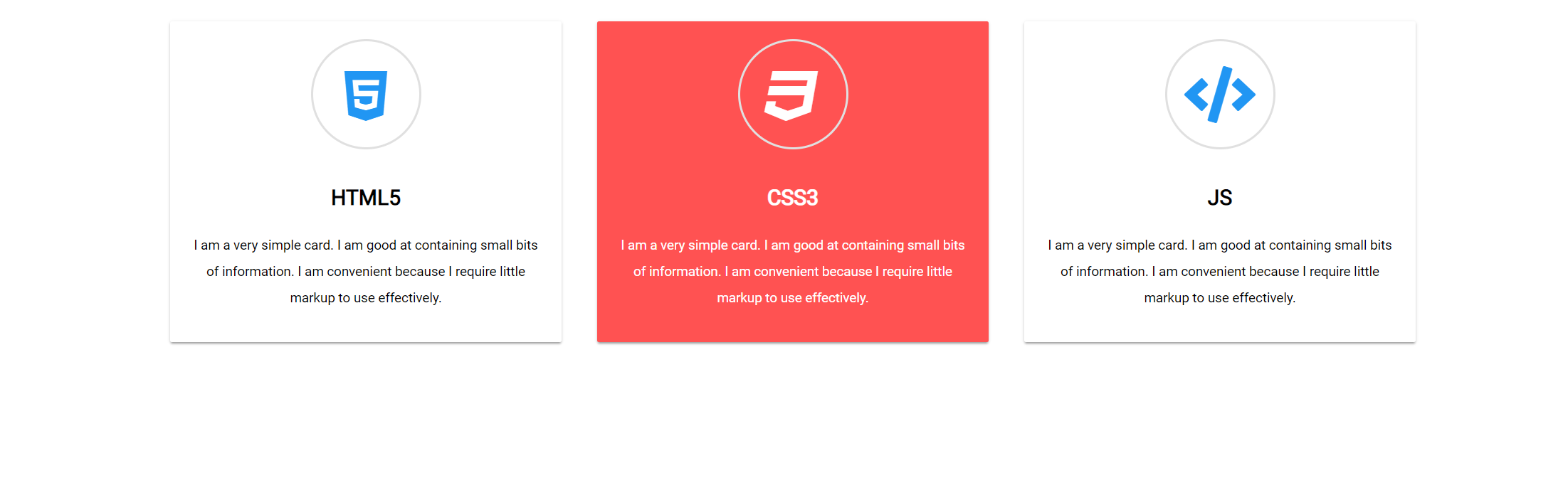
How will look final project?
Our final project will look like this.
So after we know what we our going to do, let’s start it.
First we need to write our html for one card and after that we will copy and past it two times, but in our second card we will add one more class to make our icon different color. In general our html will look like this.
HTML Section
[code language="html"]
<head>
<link href="https://fonts.googleapis.com/css?family=Montserrat:400" rel="stylesheet">

<link src="https://use.fontawesome.com/releases/v5.3.1/css/all.css"></script>

</head>

<div class="card">
    <div class="card-circle">
      <i class="fab fa-html5 fa-4x"></i>
  </div>
  <div class="text-content">
    <span class=card-title><strong>HTML5</strong></span>
    <p>I am a very simple card. I am good at containing small bits of information.
                    I am convenient because I require little markup to use effectively.</p>
  </div>
</div>
<div class="card">
    <div class="card-circle">
      <i class="fab fa-css3 fa-4x"></i>
  </div>
  <div class="text-content">
    <span class=card-title><strong>CSS3</strong></span>
    <p>I am a very simple card. I am good at containing small bits of information.
                    I am convenient because I require little markup to use effectively.</p>
  </div>
</div>
<div class="card">
    <div class="card-circle">
      <i class="fas fa-code fa-4x"></i>
  </div>
  <div class="text-content">
    <span class=card-title><strong>JS</strong></span>
    <p>I am a very simple card. I am good at containing small bits of information.
                    I am convenient because I require little markup to use effectively.</p>
  </div>
</div>

[/code]
So we have div class="card" after that circle for our icon (div class="card-circle") and in it we have our icon. Next is our container for the text in div class="text-content" and our title has span class="card-title".
CSS Section
Let’s now style our cards.
To make our cards responsive and centered we use flexbox.
body{
  display: flex;
  justify-content: center;
  align-items: center;
  flex-wrap: wrap;

}
After that before we add all styles for our card we need also to use flexbox rules to make everything in our card centered. So our card css will look like this.
.card{
  display: flex;
  justify-content: center;
  align-items: center;
  flex-direction: column;
  width: 400px;
  height: auto;
  position: relative;
  border-radius: 2px;
  background-color:#fff;
  box-shadow: 0 2px 2px 0 rgba(0, 0, 0, 0.14), 0 1px 5px 0 rgba(0, 0, 0, 0.12), 0 3px 1px -2px rgba(0, 0, 0, 0.2);
  text-align: center;
  margin: 20px;
  padding: 20px;
  transition: all 0.3s cubic-bezier(.25,.8,.25,1);
}
Maybe you ask yourself why in our card styles we use transition: all 0.3s cubic-bezier(.25,.8,.25,1);?
We use it to make our hover еffect more natural and animated. You’ll see the effect after we add our :hover element.
So let’s keep going. To make our middle card different color we can use :nth-child()psuedo element
.card:nth-child(2){
  background-color: #ff5252;
  color: #fff;
}
The code for out components in the card is very simple:
.card-circle{
  display: flex;
  justify-content: center;
  align-items: center;
  width: 80px;
  height: 80px;
  border: 2px solid #e0e0e0;
  border-radius: 50%;
  margin-bottom: 10px;
  padding: 20px;
}

.text-content{
  font-family: 'Roboto', sans-serif;
  padding-top: 20px;
}

.card-title{
  font-size: 24px;
  font-weight: 500;
  line-height: 48px;
}

p{
  font-size: 15px;
  font-weight: 400;
  line-height: 30px;
}

i{
  color: #2196F3;
}

.fa-css3{
  color: #fff;
}
And we only need to add the hover element to make our “animated” pop-up hover effect for the cards:
.card:hover{
    box-shadow: 0 14px 28px rgba(0,0,0,0.25), 0 10px 10px rgba(0,0,0,0.22);
}
That’s how you can code Material Design Card for your website!
If you like my tutorials i’ll be grateful if you write comment or subscribe for my youtube channel it’ll help me to make more how to do tutorials.
Also you can check all code on codepen.
Comments are closed.